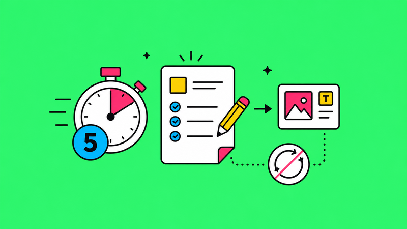
Every agency has seen it. You deliver a beautiful brand kit to a client. Logo files in every format. Colour codes. Typography specs. Usage guidelines. The whole thing is a work of art. And six months later, you find their social media manager using a stretched JPEG of the logo they pulled from their website, in completely the wrong colours, with a font that's 'close enough.'
The problem is never the brand kit itself. The problem is that most brand kits are built for designers, not for the people who actually use them day to day.
Why brand kits fail
The typical brand kit is a PDF. A beautifully designed, 40-page PDF that lives in a Google Drive folder alongside 200 other files called things like 'logo_final_v3_FINAL_use-this-one.png.' Nobody opens it. Nobody reads it. And nobody follows it.
This happens because the kit was designed as a deliverable, not as a tool. There's a huge difference. A deliverable is something you hand over at the end of a project. A tool is something people reach for when they need it. Your brand kit needs to be the second one.
What a usable brand kit actually looks like
First, kill the PDF. Or at least, stop treating it as the primary format. Your brand kit needs to live where your team actually works. That means Notion, Confluence, a shared Google Doc, or even a simple webpage. Somewhere people can find things in under 30 seconds without downloading anything.
Second, organise by task, not by asset type. Nobody searches for 'logos.' They search for 'I need to put our logo on a dark background' or 'what font do we use for headings on social.' Structure your kit around questions people actually ask.
Third, include copy-paste colour codes. Not just HEX values buried in a design spec. Actual, one-click-copy codes for every context: HEX for web, RGB for documents, Pantone for print. Put them in a table. Make them impossible to miss.
Fourth, add bad examples. Show people what NOT to do. A page of 'don't stretch the logo, don't put it on a busy background, don't use this old version' is worth more than 10 pages of positive guidelines. People learn faster from mistakes than from rules.
The folder structure that works
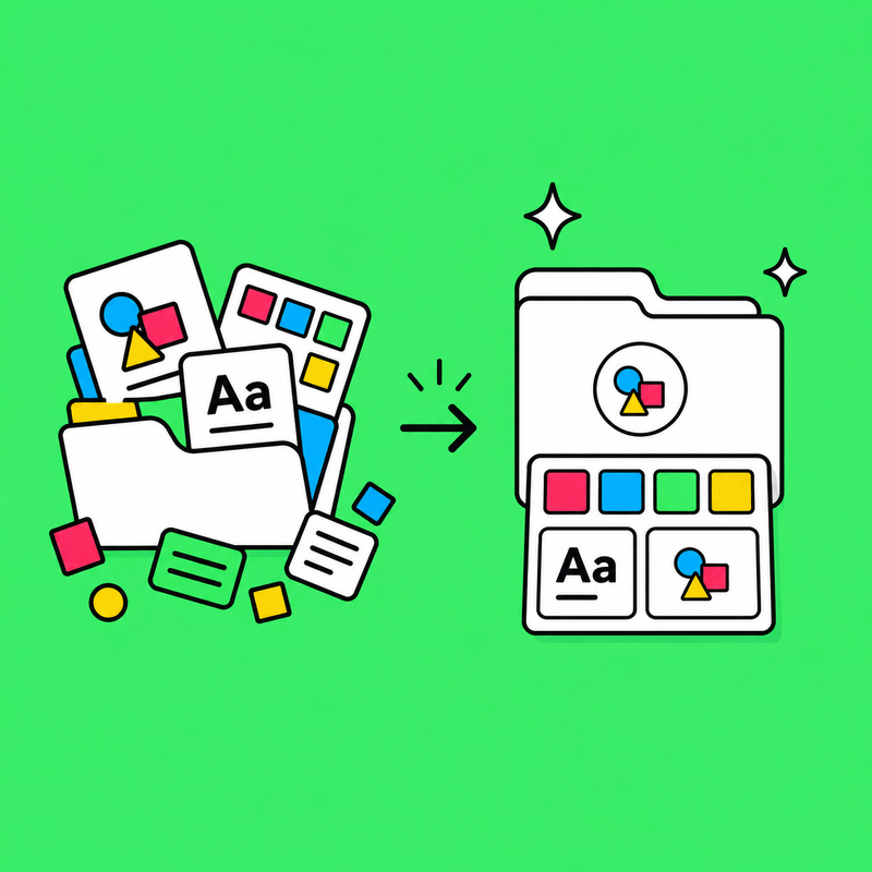
We've tested dozens of folder structures with clients. The one that gets the least pushback and the most actual usage looks like this: a top-level folder called 'Brand' with four subfolders. 'Logos' contains only the current, approved versions, named clearly (e.g., helmflux-logo-colour-rgb.png). 'Templates' contains editable files for social posts, presentations, and documents. 'Guidelines' contains the living brand guide, linked not downloaded. 'Photos and Graphics' contains approved imagery.
The key word is 'current.' Archive old versions elsewhere. If someone has to scroll past 15 outdated files to find the right one, they'll just grab whichever one loads first. And that's how you end up with the 2019 logo on a 2026 pitch deck.
The maintenance problem
A brand kit isn't a one-time deliverable. It's a living system. Someone needs to own it. Someone needs to update templates when the brand evolves. Someone needs to delete old files and add new ones. If you don't assign this responsibility, the kit will decay within months. Every single time.